The Ballot That Made a Vote Point Sideways

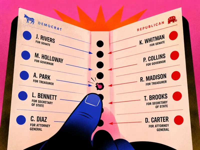
In November 2000, voters in Palm Beach County, Florida, opened a ballot that looked a little like a book.
Candidate names ran down both facing pages. The holes voters had to punch ran in a single line through the centre.
This made the type larger and easier to read, especially for older voters. It also created a much stranger task: find a candidate’s name on one side, follow its alignment towards the middle, then punch the correct hole in a separate column shared by both pages.
The ballot looked accessible. Its mapping was not.
Thousands of people appear to have cast a vote different from the one they intended. In an election ultimately decided in Florida by 537 votes, the layout became part of the result.
The ballot did not persuade people to change their politics. It changed where their hands landed.
The idea in 20 seconds
- When a control and its label are separated, the path between them becomes part of the interface.
- A choice is not complete unless people can verify the result.
- High-stakes products must be designed for tired, hurried and first-time users, not ideal ones.
- Neutral-looking design can still produce unequal errors.
Democracy depends not only on the freedom to choose, but on the ability of the interface to record that choice correctly.
Why it was called a butterfly ballot
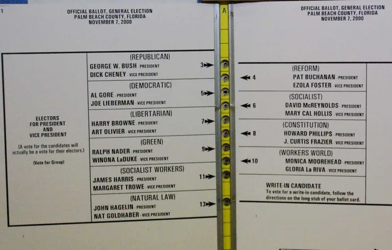
The presidential candidates were spread across two facing pages like wings. Punch holes sat along the centre binding. The order was not a simple top-to-bottom list.
George W. Bush appeared first on the left and corresponded to the first hole. Al Gore appeared second on the left but corresponded to the third hole. Pat Buchanan appeared first on the right and corresponded to the second hole. That second hole sat visually close to Gore’s name.
The voter therefore had to understand more than:
“Gore is the second candidate.”
They had to understand:
“Gore is second on the left, but his punch position is third in the centre because the holes alternate between two pages.”
That is a surprising amount of spatial reasoning for a single selection.
The numbers make the design impossible to dismiss
Palm Beach County recorded an unusually high vote for Reform Party candidate Pat Buchanan. Researchers later estimated that the ballot caused more than 2,000 Democratic voters to select Buchanan by mistake, already several times larger than the certified statewide margin.
The county also produced roughly 19,000 presidential overvotes: ballots with more than one candidate selected and therefore not counted in the presidential race. Many voters appear to have punched one candidate and then added another mark after believing they had made an error.
We cannot reopen every ballot and read a voter’s mind. But the patterns are difficult to explain as ordinary political preference. Buchanan performed far better on election-day butterfly ballots than on the county’s differently designed absentee ballots, and the anomaly was far larger than in comparable counties.
The interface left fingerprints on the data.
Mapping is the invisible wire
Every interface contains a mapping between what we see and what our action controls. Usually the mapping is obvious:
- A switch beside a light controls that light.
- A volume slider moves in the direction of louder and quieter.
- A button inside a card affects that card.
- A label directly above a field describes that field.
The butterfly ballot weakened this relationship. The candidate name and the punch hole were different objects in different places, and the voter had to mentally draw a line between them. But that invisible line crossed a busy central area shared by two pages.
The design asked the voter to supply the missing connection. Some did. Some supplied the wrong one.
It had no useful confirmation
Modern payment apps usually ask you to review the recipient and amount before money moves. The punch-card ballot offered no equivalent:
You selected Al Gore.
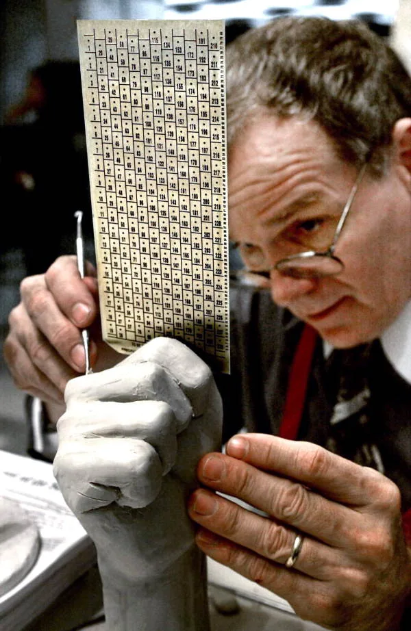
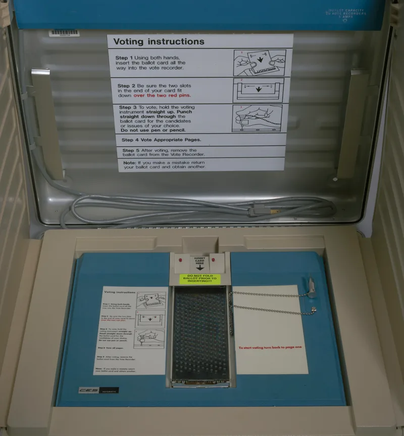
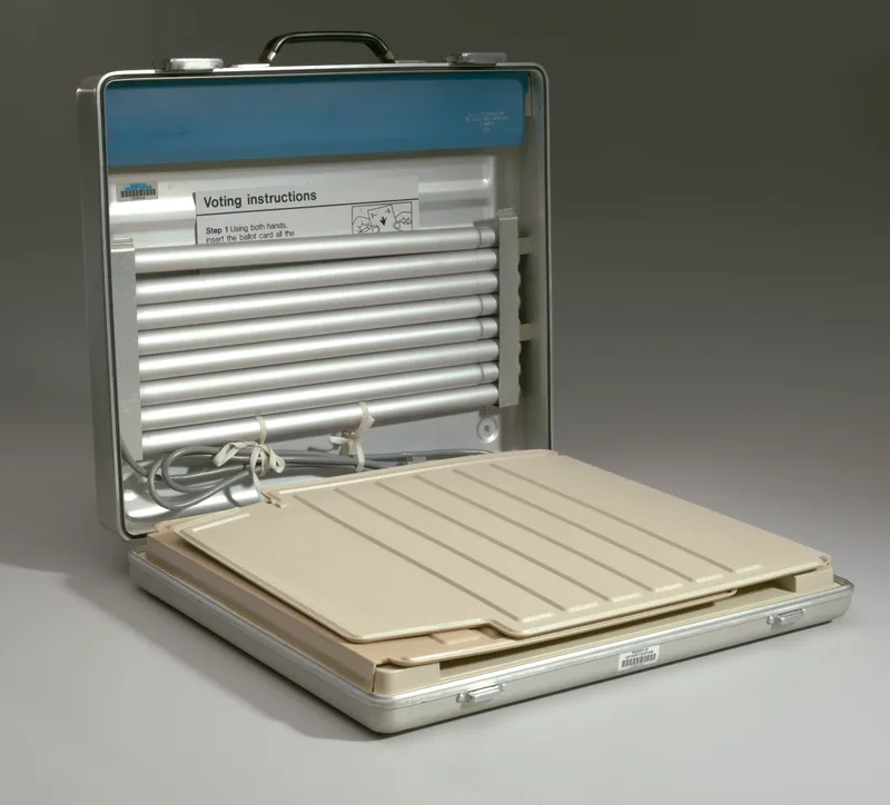
There was only a physical hole. Once punched, the ballot could not clearly explain what the machine would interpret. If the voter became uncertain and punched again, the attempt to correct the first error could invalidate the vote entirely.
This is what made the design especially fragile:
- The mapping was easy to misunderstand.
- The result was difficult to inspect.
- Correction could create a second, fatal error.
It combined weak guidance with expensive recovery.
“But the instructions were there”
This defence appears after many design failures. The ballot included arrows. Poll workers could explain how to vote. Voters could inspect the page. All true.
But instructions do not cancel confusing geometry.
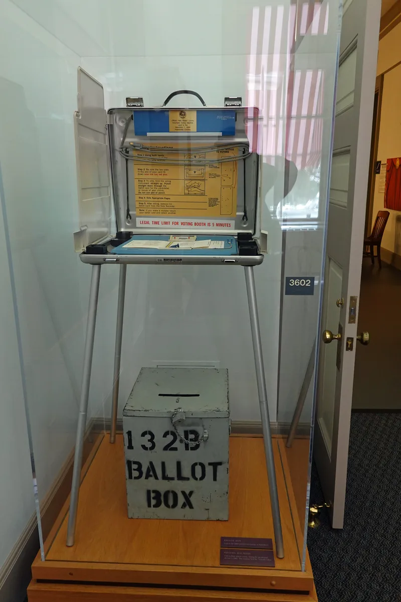
People vote under ordinary human conditions. Some have poor eyesight. Some are nervous. Some are voting for the first time. Some have limited English. Some are in a hurry. Some have been standing in a queue. Most will see that exact ballot only once.
A ballot is not a familiar productivity tool people master over time. It is a first-use interface with no onboarding, a strict time limit and almost no tolerance for mistakes. That should make it more conservative, not more inventive.
Design is not neutral when errors have a direction
The ballot did not confuse every choice equally. Its layout placed certain names and holes into misleading relationships, which meant the mistakes had a pattern.
That is a broader lesson for any product that ranks, recommends or arranges choices. Consider:
- A consent screen where “Accept” is bright and “Decline” is faint.
- A checkout where insurance looks mandatory because of its position.
- A form where one radio button appears visually attached to the wrong paragraph.
- A pricing table where the unit changes between columns.
- A medical screen where two similar drugs sit beside each other.
The interface may present every option. But presentation changes the probability of each outcome.
Design does not need an opinion to create a bias. Sometimes alignment is enough.
The ballot test
For any high-stakes choice, ask:
Is every label visibly attached to its control?
Nobody should have to trace an imaginary line.
Can the person confirm what the system recorded?
Show the interpreted choice, not merely the action taken.
Can an error be corrected without creating another error?
Recovery should be clearer than the original mistake.
Does the layout disadvantage one choice more than another?
Test error patterns, not only average completion.
Has it been tested with the people most likely to struggle?
Large type alone does not make a design accessible.
One final thought
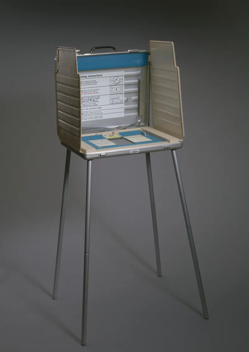
We often talk about voting as the pure expression of individual will. But will has to pass through an interface.
The person forms an intention. The ballot turns that intention into a physical mark. A machine turns the mark into data. The data becomes a count. At every step, design can preserve the intention or distort it.
The butterfly ballot is remembered because the stakes were historic. But smaller versions of it appear whenever somebody clicks the wrong plan, transfers money to the wrong person or agrees to something they did not understand.
The lesson is not that users make mistakes. We already know that. The lesson is:
When a large number of people make the same mistake, the interface has expressed an intention of its own.
Sources and further reading
More writing
 interaction designusability
Give Them the Win First
PepeJump handed every new player a reward before they'd done a thing. A note on why a number going up is the most reliable delight in UX.
 usabilityinteraction designinformation design
The Day Your Interface Disappears
Ten principles for making software feel less like an interface and more like instinct.
 usabilityerror preventionsystems design
The Wrong Line at the End of the War
How one misplaced signature on Japan's surrender document exposed the hidden choreography inside every form.