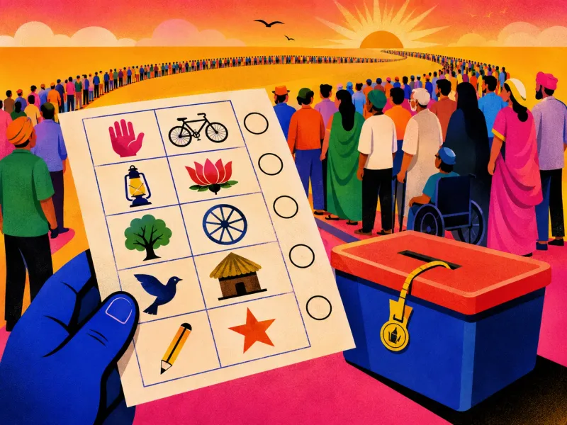
How Do You Design a Democracy for 173 Million People?

In 1951, India attempted something many observers considered wildly optimistic. It prepared to let every adult citizen vote.
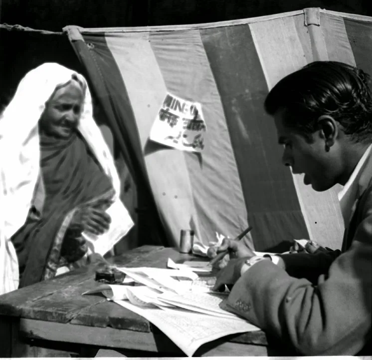
The country was newly independent. Its first electoral rolls contained roughly 173 million people. Most could not read or write. Many had no formal proof of age. Millions of women were recorded in local registers not by their own names, but as “wife of” or “daughter of” somebody else.
There were remote villages, forests, islands, mountains, unreliable roads and hundreds of languages and dialects.
India did not merely need to announce an election. It had to invent a way for an enormous and unequal population to participate in one.
This was democracy as a design problem.
The idea in 20 seconds
- Inclusion is not achieved by declaring that everybody may participate.
- A system is only universal if people can actually recognise, reach and use it.
- Symbols can function as infrastructure, not decoration.
- Sometimes the interface must change because the population should not have to.
Universal rights require deliberately non-universal solutions: different routes, formats and supports for different human realities.
The scale was almost absurd
India’s first general election took place over several months in 1951 and 1952. Election officials had to register voters, define constituencies, assign symbols, print ballots, manufacture ballot boxes, recruit and train workers, transport material and conduct polling across the country. This was before electronic databases, mobile phones, GPS or instant communication.
The physical system involved hundreds of thousands of polling stations and roughly two million steel ballot boxes.
But scale was not the hardest part. The harder problem was making one election legible to people with radically different levels of literacy, language, documentation and access.
The Constitution could grant equal voting rights in a sentence. The interface had to make that equality real.
A name was not enough
A ballot made only of written candidate names would have excluded a huge portion of the electorate. So candidates and political parties received visual symbols.
A pair of bullocks under a yoke. A hut. A tree. An elephant. A lamp.
The voter did not need to decode a paragraph. They could recognise a shape.
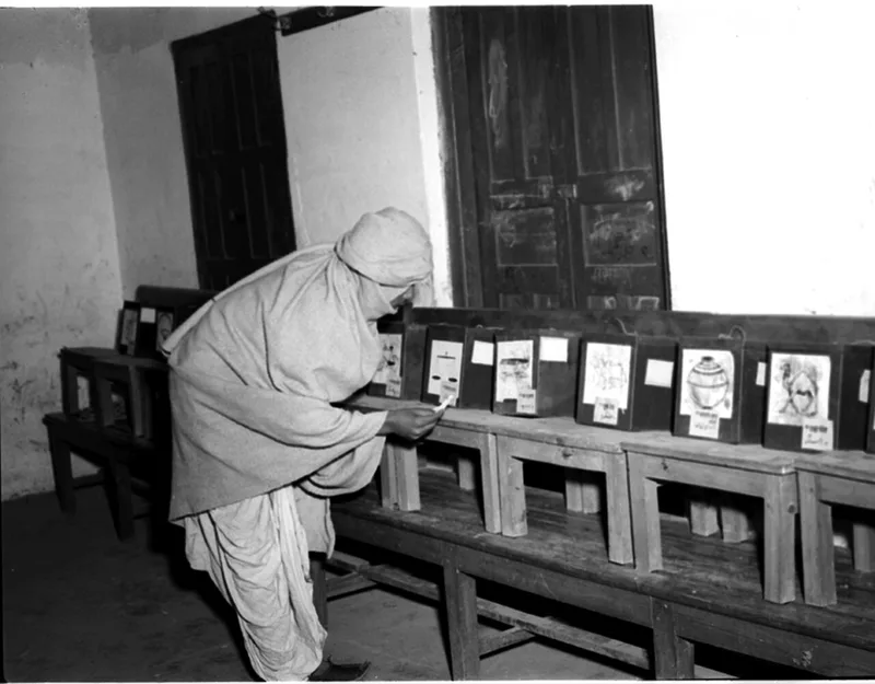
In the earliest system, each candidate had a separate ballot box displaying the candidate’s name and symbol. The voter received a ballot paper and placed it into the chosen box. That created a direct relationship: recognise the symbol, find the matching box, cast the ballot.
The symbol was not a logo added after the system had been designed. It was part of the voting mechanism itself.
Symbols are interfaces when language cannot be assumed
Designers often discuss icons as space-saving devices. India’s election symbols did something more important: they crossed literacy and language boundaries.
That does not mean symbols are naturally universal. A symbol still has to be culturally recognisable, visually distinct and easy to reproduce at many sizes and in poor printing conditions. Two symbols that look similar can create the same problem as two similar words.
So the system needed a visual vocabulary with enough difference between options to survive:
- hurried viewing,
- low-quality printing,
- unfamiliarity,
- weak eyesight,
- and translation across regions.
This is closer to designing road signs than designing a brand identity. The goal is not to look distinctive in a presentation. The goal is to remain unmistakable in the world.
The women missing from their own names
While creating the electoral rolls, officials encountered millions of women registered only through their relationship to a man. “A’s mother.” “B’s wife.”
The Election Commission insisted that eligible voters be enrolled under their own names. Records that did not identify the woman herself could not simply pass as complete.
This exposed a deeper truth about system design:
A database does not merely store the world. It decides what counts as a person inside the world.
If a citizen cannot be represented correctly in the data model, their formal right becomes difficult to exercise. The problem was not a missing text field. It was a social convention embedded in the information architecture.
We still encounter versions of it:
- forms that assume everybody has a surname,
- addresses that require a Western format,
- identity systems that cannot represent chosen names,
- family fields built around only one kind of household,
- verification flows that assume everybody possesses the same documents.
Exclusion often begins long before the final screen. It begins in the schema.
Access included geography
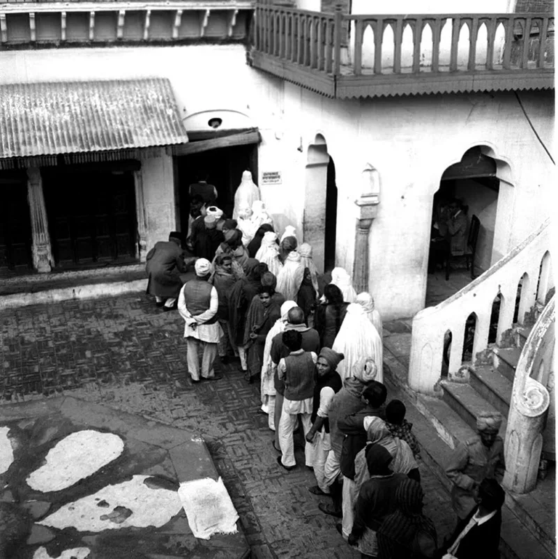
The polling station was also part of the interface. A perfectly clear ballot is useless if the voter cannot reach it.
Election material had to travel by road, rail, boat and on foot. Polling schedules had to account for weather and local conditions. Physical access was not a secondary operations problem; it was part of whether the democratic system worked.
Digital product teams often separate “experience” from “operations.” The election makes that separation look artificial. For the voter, the experience included:
- learning that they were registered,
- finding the polling place,
- reaching it,
- identifying the correct symbol,
- casting the ballot,
- and trusting that it would be counted.
Every handoff mattered. The service was larger than the artefact.
It was not elegant, and that is interesting
Separate ballot boxes for candidates required enormous amounts of material and coordination. By contemporary standards, the system looks cumbersome.
But elegance depends on the constraint you are solving for. If the primary goal is minimum hardware, the solution is inefficient. If the goal is allowing a first-time voter with limited literacy to make a secret and understandable choice, the physical redundancy starts to make sense.
Good design is not the fewest objects or the shortest flow. It is the clearest path through the actual conditions. Sometimes simplicity for the user requires complexity behind the scenes.
The inclusion test
When designing a supposedly universal service, ask:
Who exists in the data model?
Can the system represent their real name, identity, household and address?
What ability are we quietly assuming?
Literacy, vision, language, mobility, documentation, connectivity or confidence?
Is the symbol doing real work?
Can it be recognised without accompanying text and distinguished under poor conditions?
Can people reach the service?
Access includes devices, transport, timing, assistance and physical location.
Where has complexity been placed?
The system should absorb complexity when doing so makes participation simpler.
One final thought
India’s first election is often described as the world’s largest experiment in democracy. It was also one of the world’s largest acts of interaction design.
The state could have demanded that the voter adapt: learn to read, acquire the right paperwork, understand a complicated ballot and travel however far necessary. Instead, imperfectly but deliberately, the system adapted itself.
It created symbols where words were insufficient. It created polling infrastructure where geography resisted. It confronted records that failed to name women as individuals.
That is the difference between access as a promise and access as a design.
A system becomes inclusive not when everybody is invited, but when the conditions of entry stop excluding them.
The ballot box was only the final object. The real design was the path that allowed a citizen to reach it.
Sources and further reading
More writing
 systems designinformation design
Arm the Believer Inside
In a big organisation you rarely win the room yourself. You find the believer inside it, and arm them to win it for you.
 systems designinteraction design
Don't Hide the Constraint. Make It the Idea.
The limits I was handed on four projects weren't obstacles to hide. Each one turned out to be the concept, once I stopped apologising for it.
 systems designinformation design
Finalised Isn't Final
We signed off a Diwali design for TUMI. Then a VP pulled it back. A quiet lesson about where design decisions really get made.