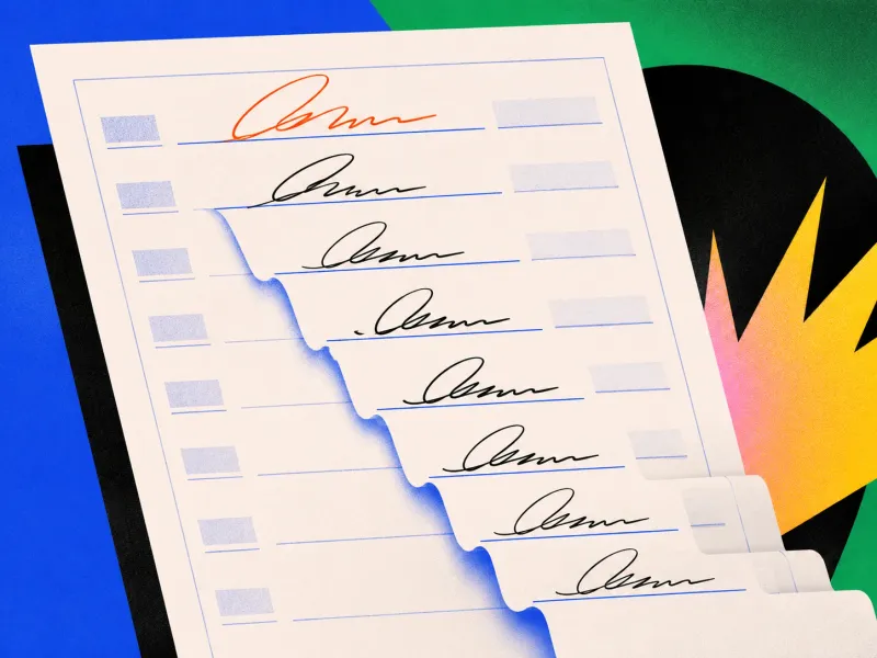
The Wrong Line at the End of the War

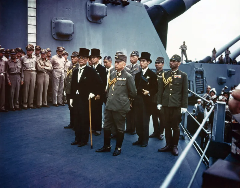
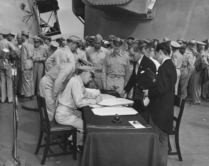
On 2 September 1945, representatives of Japan and the Allied powers gathered aboard the USS Missouri to sign the document that formally ended the Second World War.
The ceremony had generals, admirals, diplomats, cameras and an entire world watching.
It also had a form-design problem.
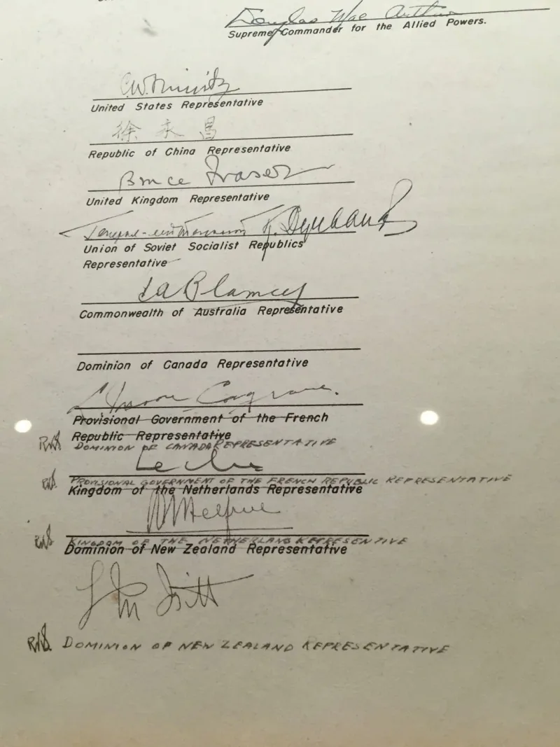
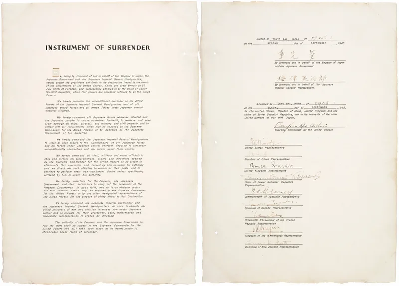
When Canada’s representative, Colonel Lawrence Moore Cosgrave, signed the Japanese copy of the Instrument of Surrender, he placed his name one line too low, on the line meant for France.
France then signed on the Netherlands’ line. The Netherlands moved down. New Zealand eventually had to sign in the blank space at the bottom.
One of the most important documents in modern history ended up with crossed-out labels and handwritten corrections. Not because anybody misunderstood the surrender. Because one person misunderstood the form.
The idea in 20 seconds
- A form is not merely a container for information. It is a sequence of actions.
- Repetition can make the wrong row look exactly like the right row.
- If one small error shifts everything after it, the design is too fragile.
- Instructions explain a form. Structure should prevent the mistake.
A good form does not only tell people what to enter. It makes entering it in the wrong place difficult.
The tiny mistake
The document had two originals: one for the Allied powers and one for Japan. On the Japanese copy, the section for Allied signatures repeated the same visual pattern: a signature line followed by a printed country label.
Cosgrave signed below the place intended for Canada. Every signatory after him inherited the displacement.
The error was corrected by Lieutenant General Richard Sutherland, General Douglas MacArthur’s chief of staff. He crossed out the printed country names, wrote the correct ones beside the signatures and initialled the changes. The surrender remained valid. History continued.
But the page is revealing because nothing about Cosgrave’s intention was unclear. He knew who he was. Everybody else knew who he represented. The only confusion was where his hand was supposed to go.
That is a design failure in its purest form:
The person knows the answer but the interface records it incorrectly.
A form is a choreography
We often treat a form as a static arrangement of labels, lines and boxes. The user experiences something else. They move through it.
They locate their place, connect a label to a field, enter something, then move to the next field. Their eyes and hands follow a choreography created by spacing, alignment and sequence. When that choreography is obvious, the form feels invisible. When it is not, people skip lines, attach information to the wrong label or complete the right action in the wrong place.
The surrender document’s rows were visually similar. The page relied on each signer carefully matching a country to the correct line. Once Cosgrave’s signature broke the sequence, every later action had to adapt around it.
The document contained the necessary information. It did not create a sufficiently clear path through that information.
The cascading-error problem
The most interesting part is not that one person made a mistake. People will always make mistakes. The interesting part is that the design allowed one mistake to move the entire system.
We see the same pattern in everyday products:
- One blank row in a spreadsheet shifts an import into the wrong columns.
- One omitted digit in a bank account sends money elsewhere.
- One incorrectly selected passenger makes every later field in a booking flow wrong.
- One mistaken date format turns 7 August into 8 July.
- One unchecked box changes the meaning of an entire application.
These systems are not merely error-prone. They are error-amplifying.
A resilient design contains a mistake near the place where it happens. A fragile design quietly passes it forward.
Labels are not the same as guidance
The country names were printed on the document. Technically, the lines were labelled. That was not enough.
This distinction appears everywhere in interface design. A designer adds an instruction and believes the problem is solved:
“Please select the correct account.”
“Enter the date in the required format.”
“Review all details before continuing.”
But a warning transfers the work to the user. It says, “Be more careful.” Structure does something better: it reduces the amount of care required.
Imagine if each signatory had received an individually marked space with the country name above the line, a stronger divider between entries, or a clear visual cue placed exactly where the pen should begin. The ceremony would not have needed more intelligence. The page would simply have needed less interpretation.
The design lesson
When many people make the same kind of mistake, asking them to pay attention is rarely the strongest fix.
Ask instead:
Can the wrong field look less available?
Disable impossible choices. Separate similar rows. Use stronger grouping.
Can identity already be known?
If the system knows the person, prefill or highlight the relevant section.
Can an error stop locally?
Validate each step before allowing the mistake to affect everything after it.
Can the page survive a correction?
Design for editing, recovery and exceptions, not only for the perfect first attempt.
Is the sequence visible?
Make it obvious where the person is, what they are doing and what comes next.
A useful test for any form
Give the form to somebody who already knows every answer. Then watch them.
If they still pause to locate the right field, wonder which label belongs to which box, or enter correct information in the wrong place, the problem is not their knowledge. It is the form.
That is what makes the surrender document such a useful design story. The stakes were enormous, the participants were highly accomplished and the intention was perfectly clear.
Yet the page still won for a moment.
One final thought
We tend to imagine history being shaped by speeches, battles and decisions. Sometimes it is shaped by the distance between a label and a line.
Canada’s signature did not undo the surrender. Handwritten corrections repaired the document, and everybody moved on. But the marked-up page leaves behind a wonderfully human reminder:
No moment is too important to need good interface design.
Even the end of a world war had a user flow. And for one brief moment, the user flow broke.
Sources and further reading
More writing
 usabilityinteraction designerror prevention
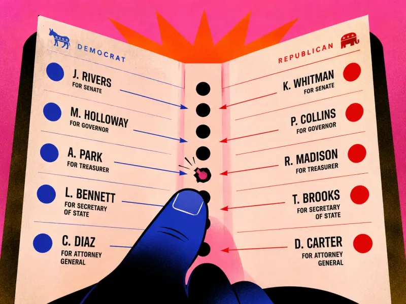
The Ballot That Made a Vote Point Sideways
What the butterfly ballot teaches us about alignment, error costs and the danger of interfaces that cannot confirm intent.
 systems designerror preventionhuman factors
The $125 Million Unit Label
The Mars Climate Orbiter was lost at the boundary between two teams, and that boundary is where many systems actually fail.
 human factorserror preventionsystems design
The Word "Takeoff" Had Two Meanings
The Tenerife airport disaster shows why critical systems cannot rely on language that merely sounds understood.