
When Every Alarm Is Urgent, None Is

At 4 a.m. on 28 March 1979, something went wrong at the Three Mile Island nuclear power plant in Pennsylvania.
Then hundreds of things appeared to go wrong.
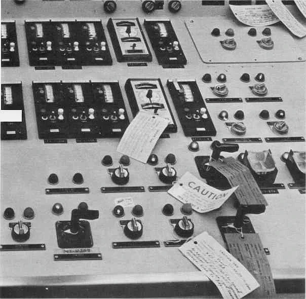
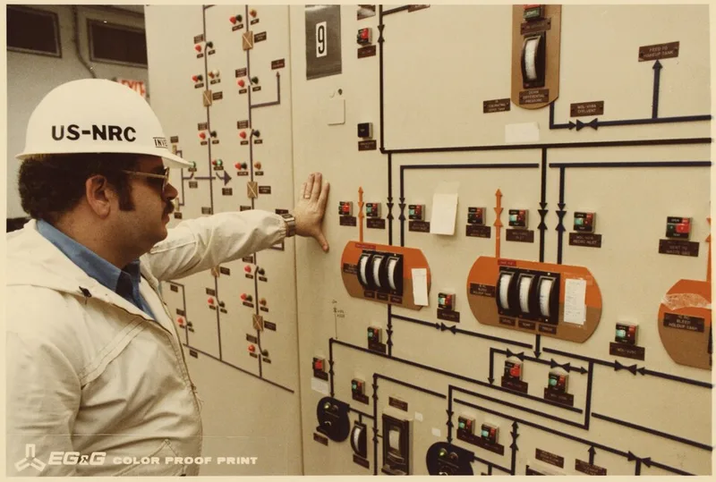
Alarms sounded. Lights flashed. Indicators changed. Printers produced information. Operators moved across a huge control panel trying to understand what the reactor was doing.
The control room contained enormous amounts of data. It did not contain a clear explanation.
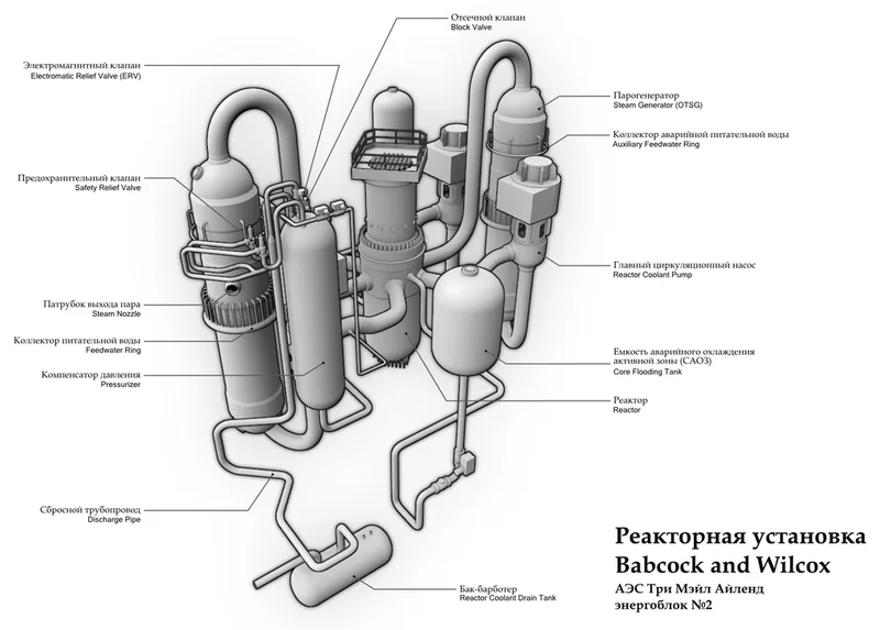
A relief valve had become stuck open, allowing coolant to escape. But the indicator in the control room showed that the command to close the valve had been sent, not that the valve had physically closed.
The interface displayed the system’s intention. The operators needed the system’s condition.
The idea in 20 seconds
- More information can reduce understanding.
- Status should describe what happened, not only what was commanded.
- An alarm is useful only if it helps somebody prioritise and act.
- In a crisis, the interface must reveal the system’s story rather than scatter its symptoms.
A dashboard can be full of correct readings and still create the wrong picture.
The accident was mechanical, human and informational
A malfunction in the plant’s secondary cooling system triggered an automatic reactor shutdown. Pressure rose in the primary system, causing a pilot-operated relief valve to open as designed.
The valve should then have closed. It did not.
Coolant continued escaping through the open valve, but operators did not initially recognise the loss. Inside the control room, the valve indicator implied “closed” because the electrical signal to close it had been issued. The indicator did not independently measure the valve’s actual physical position.
At the same time, the pressuriser’s water-level reading appeared high. Operators interpreted this as evidence that the reactor system contained too much water, even while coolant elsewhere was being lost.
Their actions made sense within the picture the interface presented. The picture was incomplete.
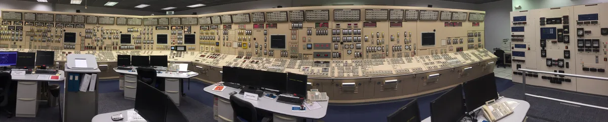
A command is not a result
This distinction sounds obvious until you notice how many products ignore it.
You press “Send.” Did the message leave your phone? Reach the server? Reach the recipient? Get read?
You press “Pay.” Was the request submitted? Authorised? Settled? Refunded?
You press “Save.” Was the file stored locally? Synced to the cloud? Saved in the correct version?
At Three Mile Island, the indicator effectively said:
We told the valve to close.
Operators read it as:
The valve is closed.
The distance between those sentences contributed to a nuclear accident.
Every asynchronous system has this danger. A command begins a process. The interface collapses that process into a reassuring label. Then the label becomes a promise the system has not yet kept.
Alarm floods are not awareness
During the early minutes of the accident, the control room was overwhelmed by alarms.
An alarm is meant to direct attention. Hundreds of alarms compete for it. This produces a paradox:
The more urgently every component demands attention, the less attention any one component receives.
Operators had to acknowledge alarms and inspect individual readings while also forming a mental model of the whole reactor. The interface organised information by equipment and panel location. The emergency unfolded as a connected chain of causes and effects.
The operators needed to know:
- Is the reactor core being cooled?
- Is coolant inventory falling?
- Which failure is primary?
- Which alarms are consequences of the same event?
- What action will stabilise the plant?
Instead, the system presented many local truths. The human had to assemble the global truth under pressure.
Severity is not priority
Designers often rank alerts by how bad each condition is. But during a complex event, the more useful question may be:
What does the operator need to act on first?
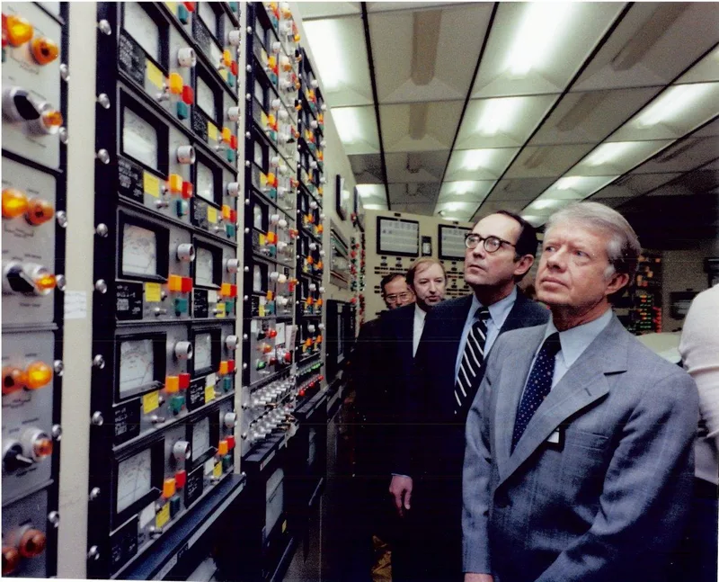
An important alarm might be the root cause, the fastest-growing danger, the condition that makes another action unsafe, or the one piece of evidence that changes the diagnosis. Priority depends on context.
A hundred red lights do not produce a hundred times more safety. They produce a red wall.
Good alert design groups related events, suppresses predictable consequences, highlights state changes and helps the operator move from symptom to cause. The goal is not to prove that the system detected everything. The goal is to help a person decide.
The interface should tell a story
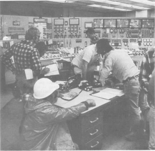
Under normal conditions, individual gauges may be enough. During an emergency, people need a narrative:
- What changed first?
- What changed because of it?
- What is the system doing now?
- What remains uncertain?
- Which action is recommended, and why?
This does not mean hiding raw data. It means organising data around the task of understanding.
Modern systems can show timelines, grouped incidents, causal relationships and confidence levels. They can distinguish a confirmed physical state from a command, prediction or inference. The interface should make uncertainty visible instead of quietly converting it into certainty.
“Close signal sent” is honest. “Valve closed” requires evidence.
The control-room test
For any operational dashboard, ask:
Are we showing a command or a confirmed outcome?
Name the difference explicitly.
Can related alerts be grouped into one incident?
Do not make people manually connect symptoms.
What should receive attention first?
Prioritise decisions, not simply component severity.
Can the operator see change over time?
A trend often explains more than a snapshot.
What is uncertain?
Mark inferred, delayed, missing or unverified information.
Does the screen support the emergency state?
An interface optimised for routine monitoring may fail during a crisis.
This appears in quieter products too
Most of us will never design a nuclear control room. But we design systems with the same habits.
A project dashboard shows twenty overdue tasks without identifying the one blocking everything. A health app sends so many reminders that every notification becomes background noise. A monitoring tool reports every server symptom separately during one outage. A banking app says “successful” when it only means “request received.” A delivery app shows “shipped” without explaining that the parcel has not been collected.
The stakes differ. The design problem is the same:
The system reports what it knows in the structure it stores it, rather than the structure a person needs to understand it.
One final thought
After Three Mile Island, the nuclear industry made major changes to operator training, emergency procedures, instrumentation and control-room human factors.
The accident became a lesson not because the operators had no information. They had too much information of the wrong shape.
We often praise dashboards for being comprehensive. Every metric is present. Every state has a light. Every event creates an alert. But completeness is not comprehension.
The purpose of an interface is not to display the system. It is to help a person form the right picture of the system.
When the picture is wrong, correct data can still lead to the wrong action. And when every alarm is urgent, urgency disappears.
Sources and further reading
More writing
 usabilityinteraction designinformation design
The Day Your Interface Disappears
Ten principles for making software feel less like an interface and more like instinct.
 information designwayfindingusability
The Map That Lied So London Could Make Sense
Harry Beck's Underground map abandoned geographical accuracy and became more truthful about the journey people were actually making.
 usabilityinteraction designhuman factors
The Door That Blames You
Norman doors reveal why repeated human error is often an object communicating badly.