
The Door That Blames You

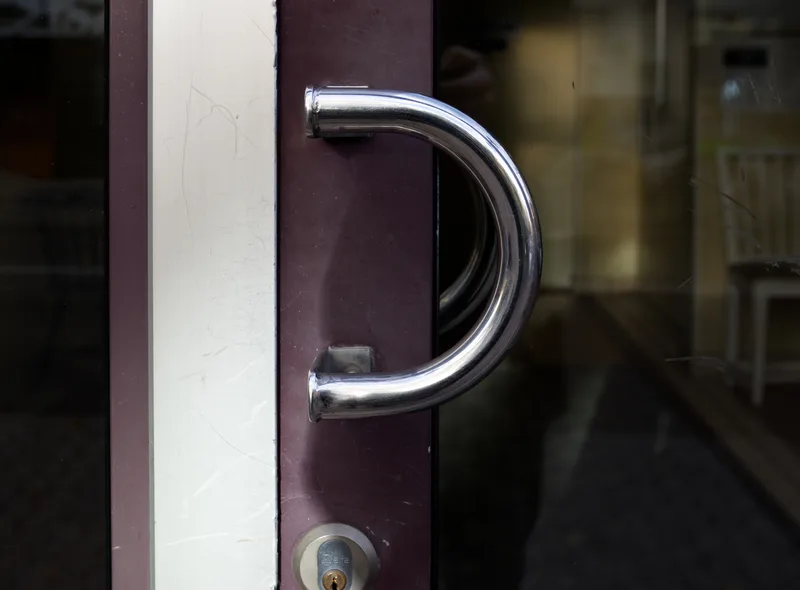
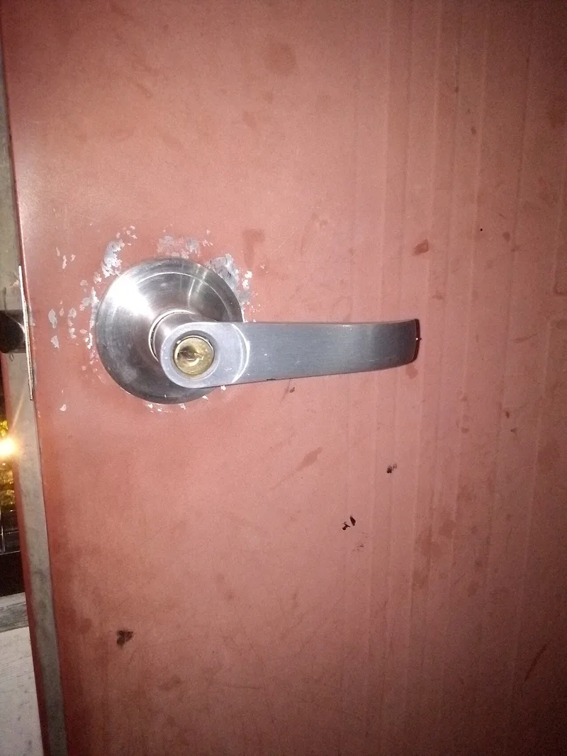
You walk towards a glass door. It has a large vertical handle. You pull.
Nothing happens.
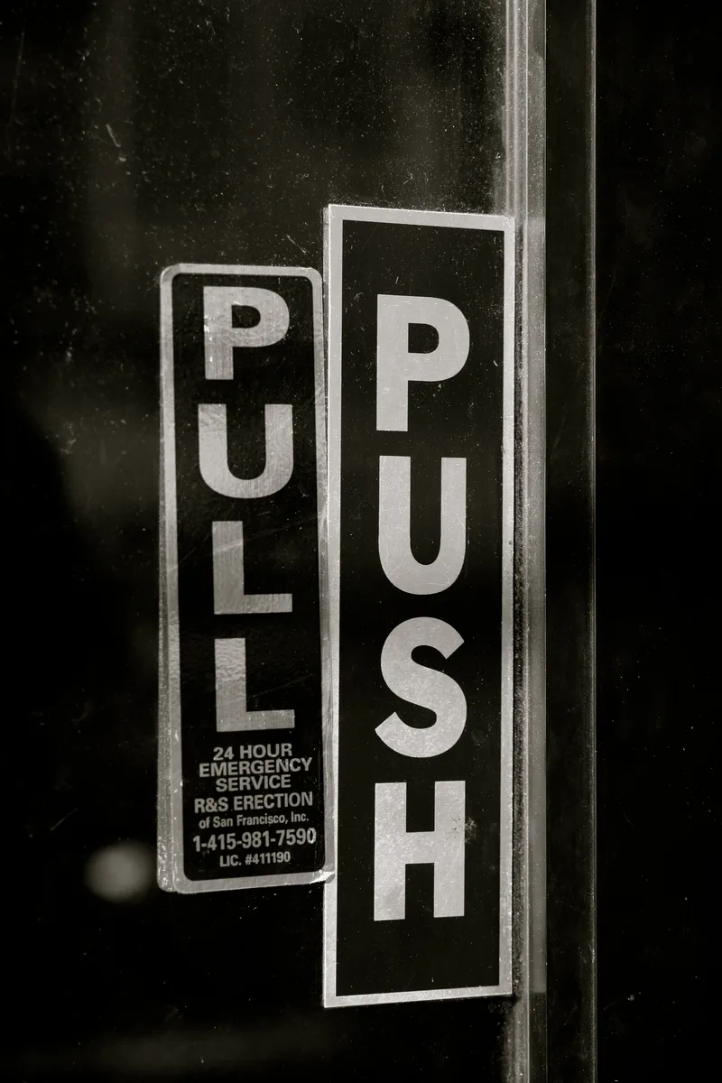
Then you notice the small sign:
PUSH
You push, enter and feel briefly foolish. But the door told you to pull. The handle existed to be grasped. Its shape suggested that your hand should wrap around it and bring it towards you, and the word asked for the opposite movement.
You did not fail to use the door. The door issued two conflicting instructions and blamed you for choosing the stronger one.
That is a Norman door.
The idea in 20 seconds
- Objects communicate through shape, position and movement before words.
- A sign often repairs a conversation the object should have handled itself.
- If many people make the same mistake, the behaviour is evidence.
- Good design makes the correct action feel available and the wrong one feel difficult.
Instructions should clarify an interaction, not contradict what the object already appears to say.
Why it is called a Norman door
The term is named after Don Norman, author of The Design of Everyday Things. Norman used doors to explain how design communicates possible actions. A flat plate suggests pushing. A handle suggests grasping and pulling. The physical object provides a signifier: a perceivable clue about how it should be used.
A confusing door often puts the same handle on both sides because symmetry looks neat. But a door that opens in one direction does not have symmetrical behaviour. The architecture has chosen visual consistency over usable truth.
Then somebody adds “PUSH” and “PULL” stickers. The signs are not proof that the problem was solved. They are evidence that the original design lost the argument.
We read form before we read words
Humans constantly infer action from appearance. A raised button asks to be pressed. A slider asks to be dragged. An underlined phrase looks clickable. A card with a visible edge looks like it can move, and a recessed area looks like it can contain something.
We make these predictions before reading instructions, because physical behaviour has taught us patterns over a lifetime.
This is why a tiny “PUSH” label struggles against a large pull handle. The label is one word. The handle is an entire physical invitation.
The digital Norman door
Software has plenty of doors that say one thing and do another. A button looks disabled but is tappable. A card looks tappable but only the small title is a link. An icon resembles “download” but means “share.” A swipe gesture works in one list but not another. A destructive action is styled like an ordinary secondary button. A text field looks complete but rejects the input only after submission.
In each case, the interface encourages one prediction and rewards another. The user’s first action becomes a test, and when it fails, the product calls the result “user error.”
Repeated mistakes are research
Suppose one person pulls a push door. Perhaps they were distracted. Now suppose fifty people do it every day. The pattern is information.
Designers sometimes defend an interface by explaining how it is supposed to work. But use is not a debate. If people repeatedly choose the same wrong action, the interface has created a reliable expectation, and that expectation matters more than the designer’s intention.
Analytics can reveal digital Norman doors:
- repeated taps on non-interactive elements,
- immediate backtracking,
- rage clicks,
- form corrections concentrated in one field,
- support questions that use the same wording,
- users opening the wrong menu again and again.
These are not merely mistakes in the dataset. They are the product describing itself through behaviour.
Constraints are kinder than correction
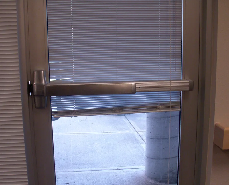
A well-designed push door often has a flat plate and no pullable handle. The correct action is visible and the wrong action is physically awkward. This is a constraint: the design reduces the space of possible mistakes.
Digital products can do the same:
- disable impossible dates,
- format phone numbers while they are entered,
- prevent selecting mutually exclusive options,
- hide actions that do not apply,
- make an entire card tappable instead of one tiny area,
- place a drag handle only where dragging works.
The system should not wait for the user to fail and then explain the rule. It should embody the rule.
“But people will learn”
They often do. People learn which side of the office door needs an awkward push. They learn that the logo is the real home button. They learn that a grey control is somehow active.
Learning does not prove the design is intuitive. It proves humans are adaptable.
This distinction matters because habitual users can hide a bad interface. They have built private workarounds and no longer notice the friction. Then a new user arrives and meets the door as it actually is.
Expertise can make a design look better than it deserves.
The door test
For any interaction, ask:
What action does the shape suggest before the copy is read?
Appearance speaks first.
Does the correct action have the strongest signifier?
Do not make a small label fight a large visual cue.
Can the wrong action be constrained?
Prevention is better than an error message.
Are repeated mistakes being blamed on individuals?
Look for patterns across people.
Would a first-time user predict the outcome?
Familiar users may have memorised the contradiction.
One final thought
The Norman door is funny because the mistake is small. Nobody wants to admit defeat to a rectangle.
But it contains a serious design philosophy:
When an object is misunderstood, examine what the object communicated before judging the person who misunderstood it.
This principle scales from doors to ballots, medical devices, financial systems and software. People arrive with reasonable expectations built from the world. Design can work with those expectations, deliberately teach a new one, or contradict them and attach a sign.
The best door does not need to say “PUSH.” It simply gives you nothing sensible to pull.
Sources and further reading
More writing
 interaction designusability
Give Them the Win First
PepeJump handed every new player a reward before they'd done a thing. A note on why a number going up is the most reliable delight in UX.
 interaction designhuman factors
Google Pay Taught a Country a Gesture. I Borrowed It.
The best way to teach a new action is not to teach it. Borrow one people already know in their fingers, and point it somewhere new.
 human factorsinteraction design
My Friend's Guruji Said No. I Shipped Anyway.
I turned a MacBook into a harmonium with an AI's help. The master's ear said no. Mine couldn't tell the difference. So I shipped it anyway.