The Map That Lied So London Could Make Sense

The London Underground map is wrong.
Stations are not spaced evenly. Lines do not turn only at neat 45- and 90-degree angles. Central London is not as large as it appears. The River Thames has been politely rearranged around the diagram.
And that is exactly why the map works.
In the early 1930s, Harry Beck, an electrical draughtsman, looked at the growing Underground network and treated it less like geography and more like a circuit. Passengers underground could not see the streets above them anyway.
What they needed to know was:
- Which line am I on?
- Where do I change?
- How many stops remain?
- In what order will stations appear?
Beck removed the truth people did not need so the useful truth could become visible.
The idea in 20 seconds
- Accuracy is only useful in relation to a task.
- Removing detail can reveal a structure hidden by reality.
- A representation should preserve what the user needs, not everything the system knows.
- Distortion becomes honest when its rules are consistent and its purpose is clear.
The best map is not the one that most faithfully copies the territory. It is the one that helps somebody move through it.
Before Beck, the network was outgrowing the page
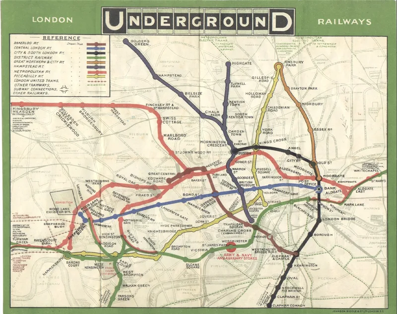
Early Underground maps were geographical. Rail lines sat over recognisable streets and real distances, which was logical when the network was small.
As it expanded, geography became a problem. Stations in central London crowded together while outer branches stretched towards the edges. To fit everything on a pocket-sized page, designers had to compress labels in the centre or cut off distant parts of the network.
The map was accurate about distance. It was becoming unclear about connection.
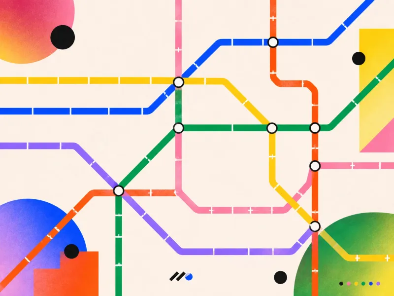
Beck changed the priority. He straightened routes into horizontal, vertical and diagonal lines. He spaced stations more evenly. He enlarged the dense centre and compressed the suburbs. He emphasised interchange stations and used colour to distinguish routes.
The result looked like a system rather than a city. That was the breakthrough.
Every representation chooses a truth
No map contains everything. A road map removes building interiors. A weather map removes property lines. A floor plan removes furniture unless the furniture matters. Even a satellite image chooses a height, a time and a spectrum.
The question is never:
Is this a complete copy of reality?
The question is:
Which parts of reality does this representation preserve?
Beck’s map preserved topology: the sequence of stations and the connections between lines. It sacrificed geographical scale. For travelling by train, that was often the correct trade.
Clarity can be more truthful than accuracy
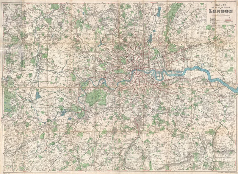
Suppose two stations are physically close but require several changes by train. A geographic map makes them look easy to reach.
Now suppose two stations are far apart above ground but connected directly by one line. A geographic map makes that journey look difficult.
Which map is “more accurate” for the passenger? The answer depends on what the passenger is trying to do.
This distinction appears across product design:
- A fitness dashboard rounds data so trends are easier to see.
- A finance app groups transactions into categories rather than showing raw ledger entries.
- A project timeline compresses quiet periods and expands busy ones.
- A progress bar translates many invisible processes into one understandable direction.
- A delivery tracker shows meaningful stages rather than every warehouse scan.
The raw data may be exact. The designed representation may be more useful.

The confidence of a consistent rule
Beck did not distort the map randomly. The map had a visual grammar:
- limited line angles,
- consistent station marks,
- colour-coded routes,
- clearer interchanges,
- regularised spacing.
Once users understood the grammar, they could read unfamiliar parts of the network. This is why consistency matters beyond aesthetics: it lets a small amount of learning travel.
A user learns what one interchange symbol means and can apply that knowledge everywhere. They do not need a fresh explanation at every station. The diagram becomes predictable even when the journey is new.
The map also changed the city in people’s heads
Representations do not only describe reality. They shape how we imagine it.
Londoners began to think of places through the logic of the Tube: on the Central line, two stops after this, one change from that. Areas that looked adjacent on the diagram felt connected. Areas separated by awkward changes felt distant. The network became a mental geography laid over the physical city.
Every successful interface does something similar. A music app turns songs into playlists and genres. A marketplace turns millions of objects into categories and filters. A social network turns relationships into followers, connections and groups.
The structure shown by the product becomes the structure users remember. Information architecture is never merely organisation. It is a proposal for how the world should be understood.
The useful-distortion test
When simplifying complex information, ask:
What decision is the person trying to make?
Preserve what affects that decision.
Which accuracy can be safely sacrificed?
Do not preserve detail merely because it exists.
Is the distortion systematic?
Consistent rules build trust; arbitrary manipulation destroys it.
What wrong conclusion could the simplification create?
The Tube map is poor for estimating walking distance. A complementary map may be needed.
What mental model will people carry away?
The representation will influence what they believe the system is.
Not every journey needs the same map
Beck’s diagram is excellent for choosing a route through the Underground. It is less useful for deciding whether to walk between two nearby stations.
This does not make the design flawed. It makes the design specific. The mistake would be pretending one representation can serve every task.
Good products often need multiple views:
- a chart for the trend and a table for exact values,
- a list for scanning and a map for proximity,
- a summary for orientation and details for verification,
- a diagram for connections and geography for distance.
Clarity is not achieved by finding the one perfect view. It is achieved by choosing the right view for the current question.
One final thought
Designers are often told not to mislead. That is correct. But it can tempt us to preserve every detail, every edge case and every piece of raw data, as if completeness guarantees honesty.
It does not. Sometimes completeness hides the thing a person most needs to see.
Harry Beck made London less geographically accurate and more navigable. He drew a city that did not exist above ground but became completely real the moment someone entered the Underground.
A useful abstraction leaves things out on purpose, so that what remains can be read at a glance.
The map did not copy London. It gave Londoners a way to hold the network in their heads.
Sources and further reading
More writing
 usabilityinteraction designinformation design
The Day Your Interface Disappears
Ten principles for making software feel less like an interface and more like instinct.
 information designhuman factorsusability
When Every Alarm Is Urgent, None Is
Three Mile Island showed that displaying information is not the same as helping somebody understand a crisis.
 information designwayfindingsystems design
Designing for Someone Moving at 70 mph
Britain's road signs show what happens when typography, language and environment are treated as one system.