
The context
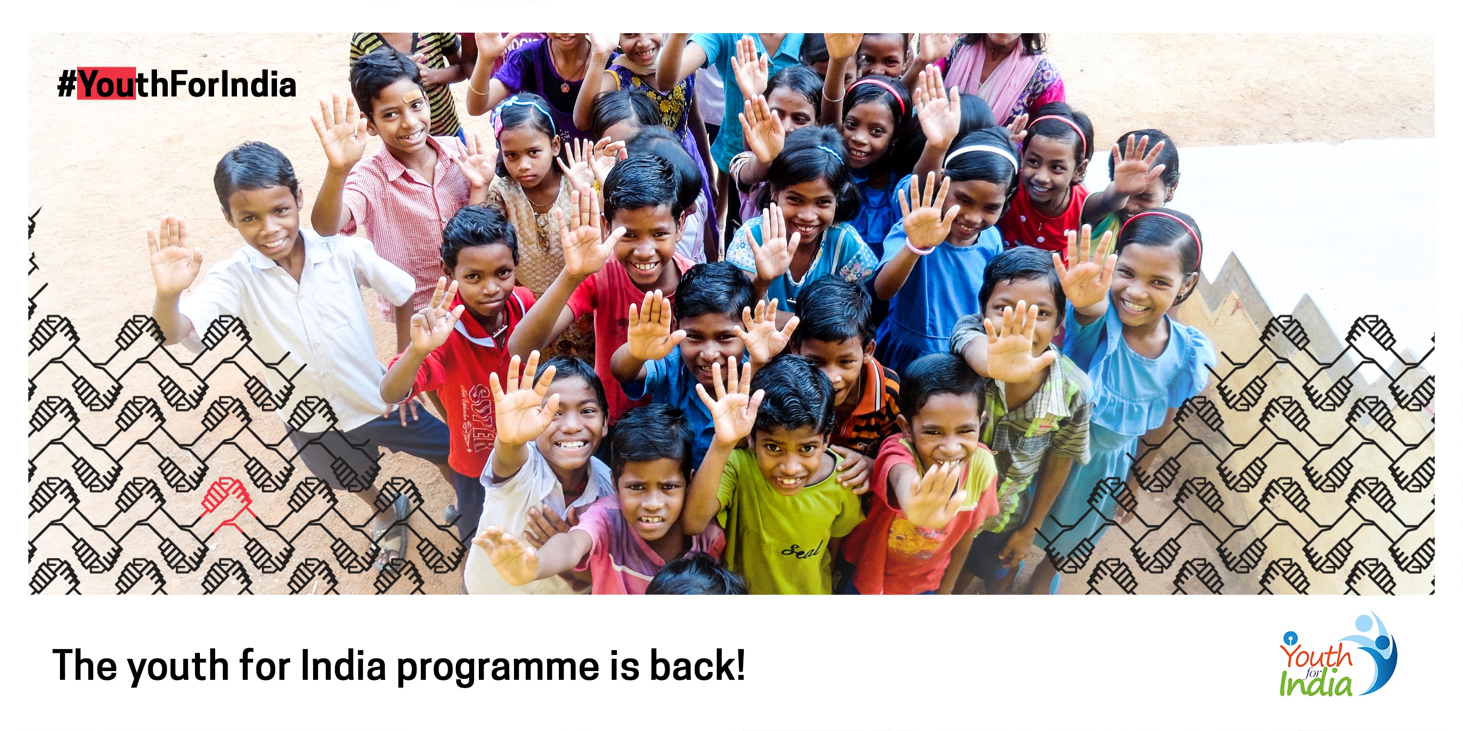
In 2017, SBI Youth For India (YFI), a flagship fellowship by India’s largest public sector bank was facing a quiet but serious problem.
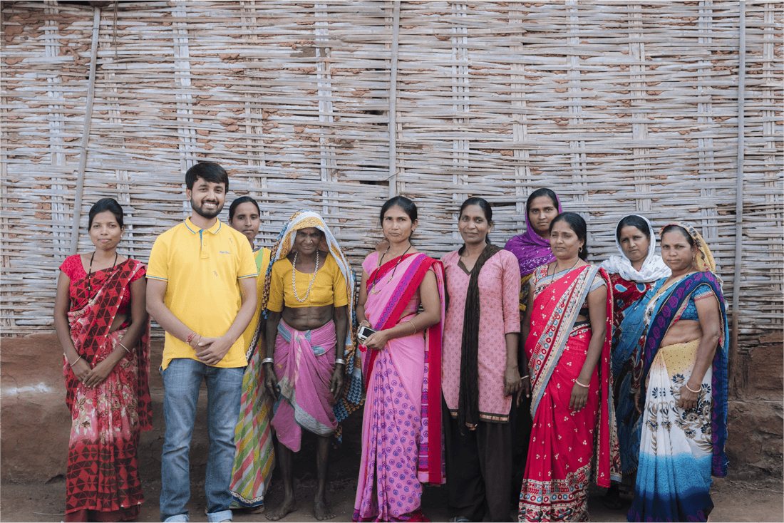
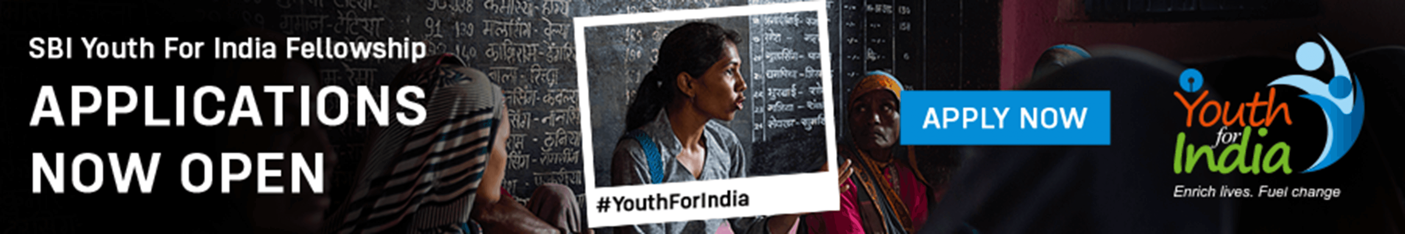
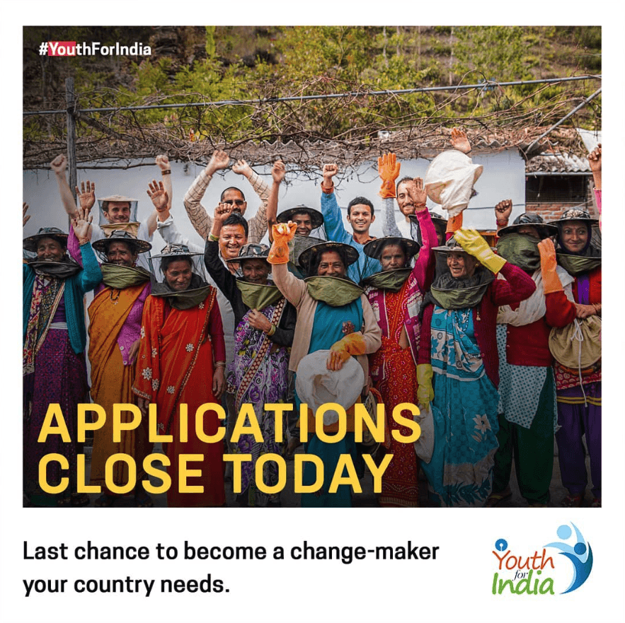
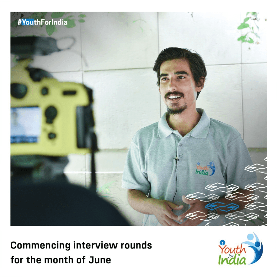
Every year, lakhs of young Indians applied to a 13-month rural fellowship that would fundamentally change how they see the country.
Yet, despite the scale and intent, the program lacked a clear identity, cohesive communication, and a usable application experience.
This wasn’t just a design problem.
It was a future-of-the-program problem.
The challenge
The real issue wasn’t quantity. It was quality.
Despite high awareness, YFI wasn’t attracting enough applicants who truly understood:
What rural immersion meant
What sacrifice the fellowship demanded
What kind of mindset was required to sustain impact beyond 13 months
If this continued, the fellowship risked losing relevance, and eventually, funding.

The starting point
When we stepped in:
There was no consistent visual system
The application form UX was broken, confusing, and fragile at scale
Communication lacked emotional clarity, what does YFI really stand for?
At the same time, we were working with:
A government-backed institution
Multiple approval layers
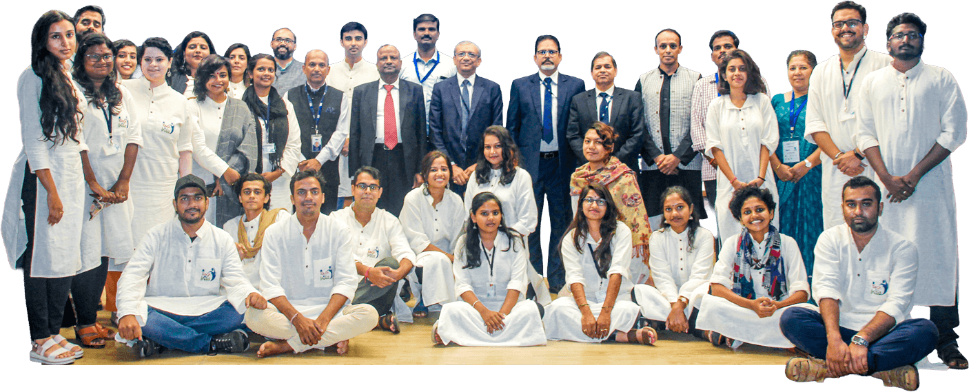
Feedback from a lot of players, from senior SBI leadership to young team members in the YFI team
The upside?
We had direct access to the CEO, internal teams, and YFI alumni, many of whom were former fellows themselves.
The instinct
My first reaction was simple:
We can’t design this without learning about it deeply.
So we didn’t open a canvas.
Instead, we:
Spoke to former fellows
Attended alumni meetups
Observed how they spoke about villages, community, failure, patience
Understood the emotional arc of the fellowship, and the process
This highly influenced how we thought about the fellowship and the problem statement.
The big idea
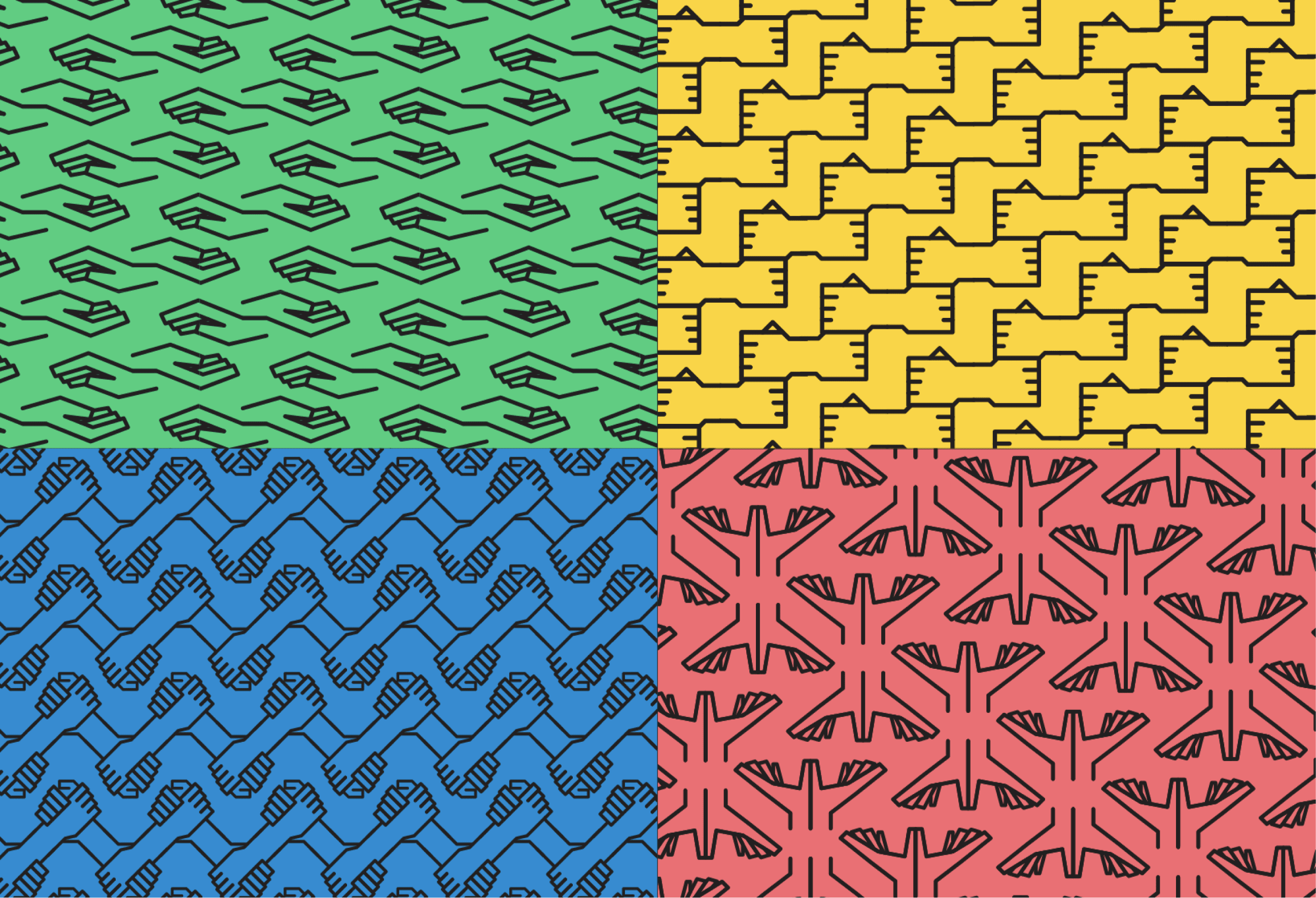
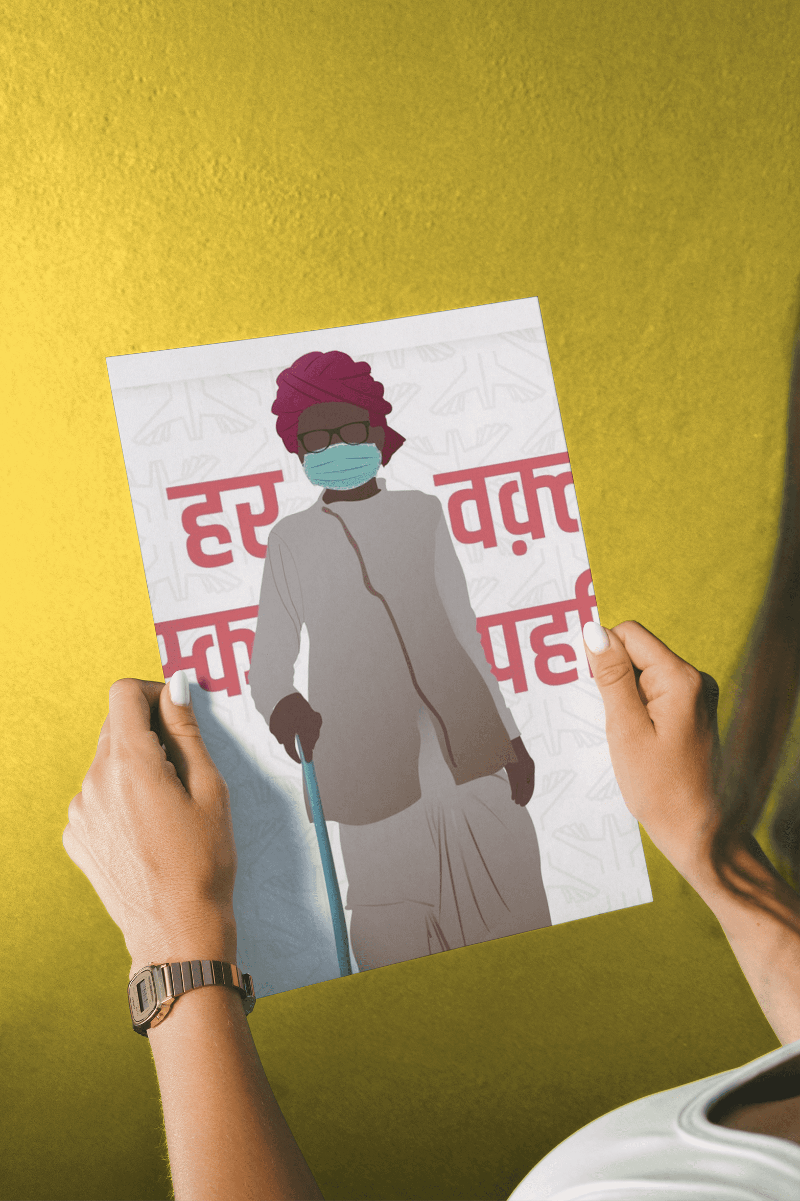
Create a symbol-based visual language that transcends language itself
India doesn’t speak one language.
Rural India speaks hundreds.
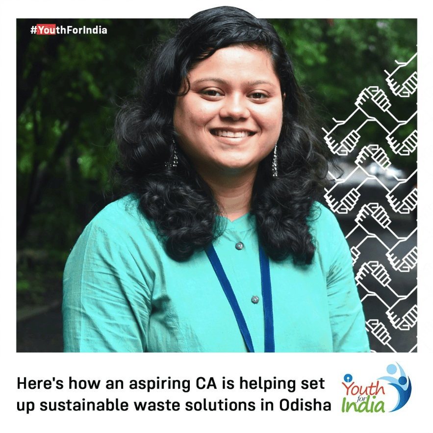
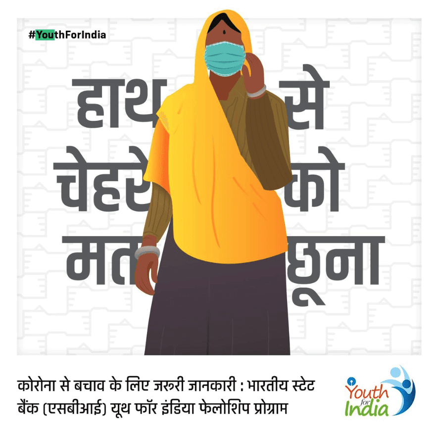
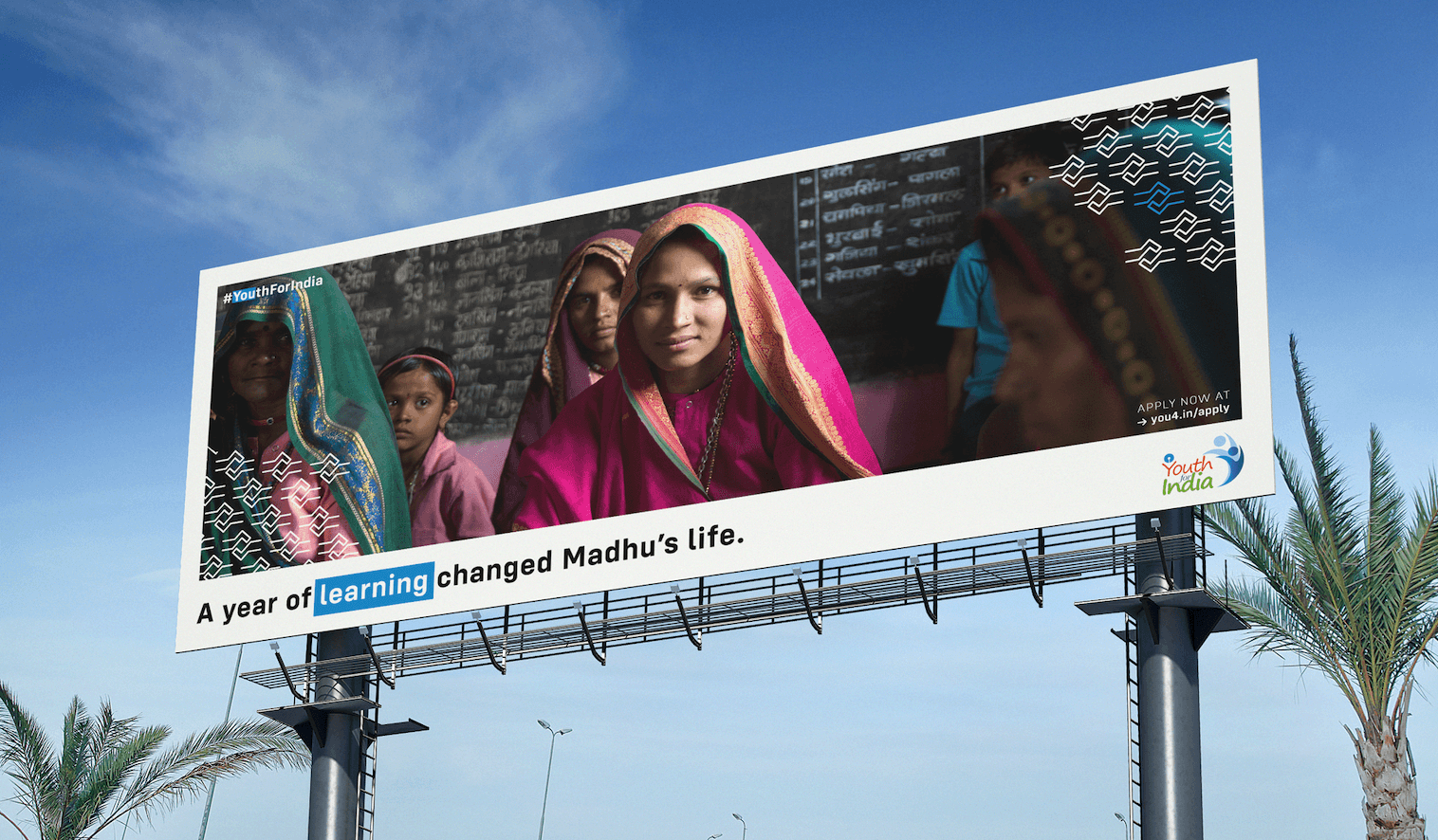
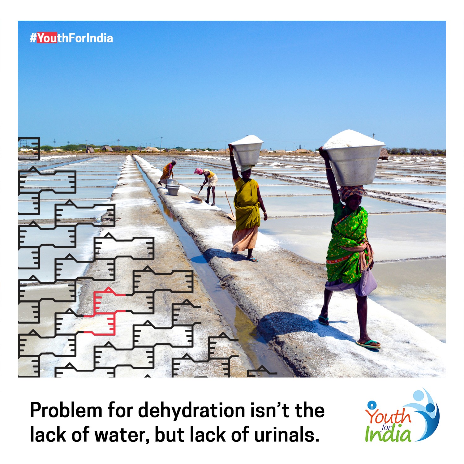
We created a symbol-based visual language, inspired by Indian Sign Language, that could express the philosophy of the fellowship without relying only on words.
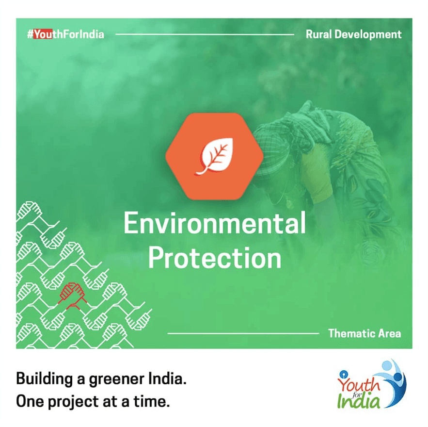
The four core symbols

Unlearn
Unlearn assumptions about rural India and the lives within it.

Collaborate
Work with the community to truly understand their problems.

Build
Design and test solutions that address real needs on the ground.

Sustain
Build ownership so the work survives beyond the fellowship.
These symbols weren’t decorative. They became the foundation of everything that followed.
From thinking to doing
We turned the symbols into:
Repeating patterns
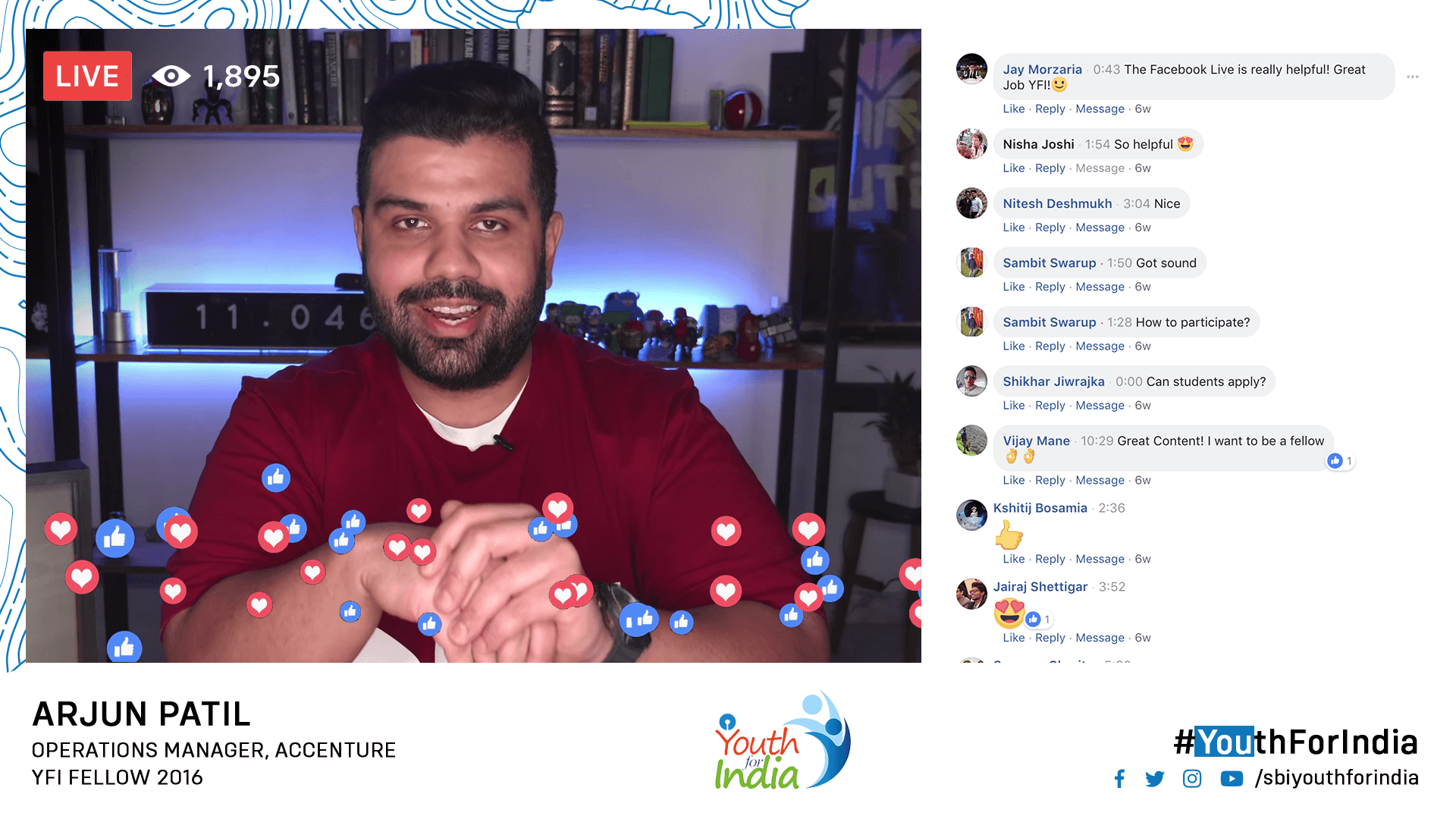
Visual anchors across social, print, live videos
A recognisable shorthand for YFI’s philosophy
Alongside this:
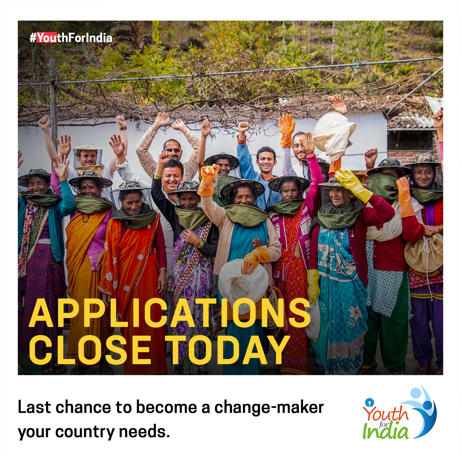
We rebuilt the application form UX to handle massive traffic while improving clarity
Enabled real-time applicant data for the first time
Ensured every touchpoint, digital or physical making it feel part of one system
A constraint that shaped the design
In 2016–17, network access in rural India was limited. Fellows couldn’t upload content in real time. Most photos, stories, and updates came days or weeks later.
Instead of hiding that delay, we embraced it.
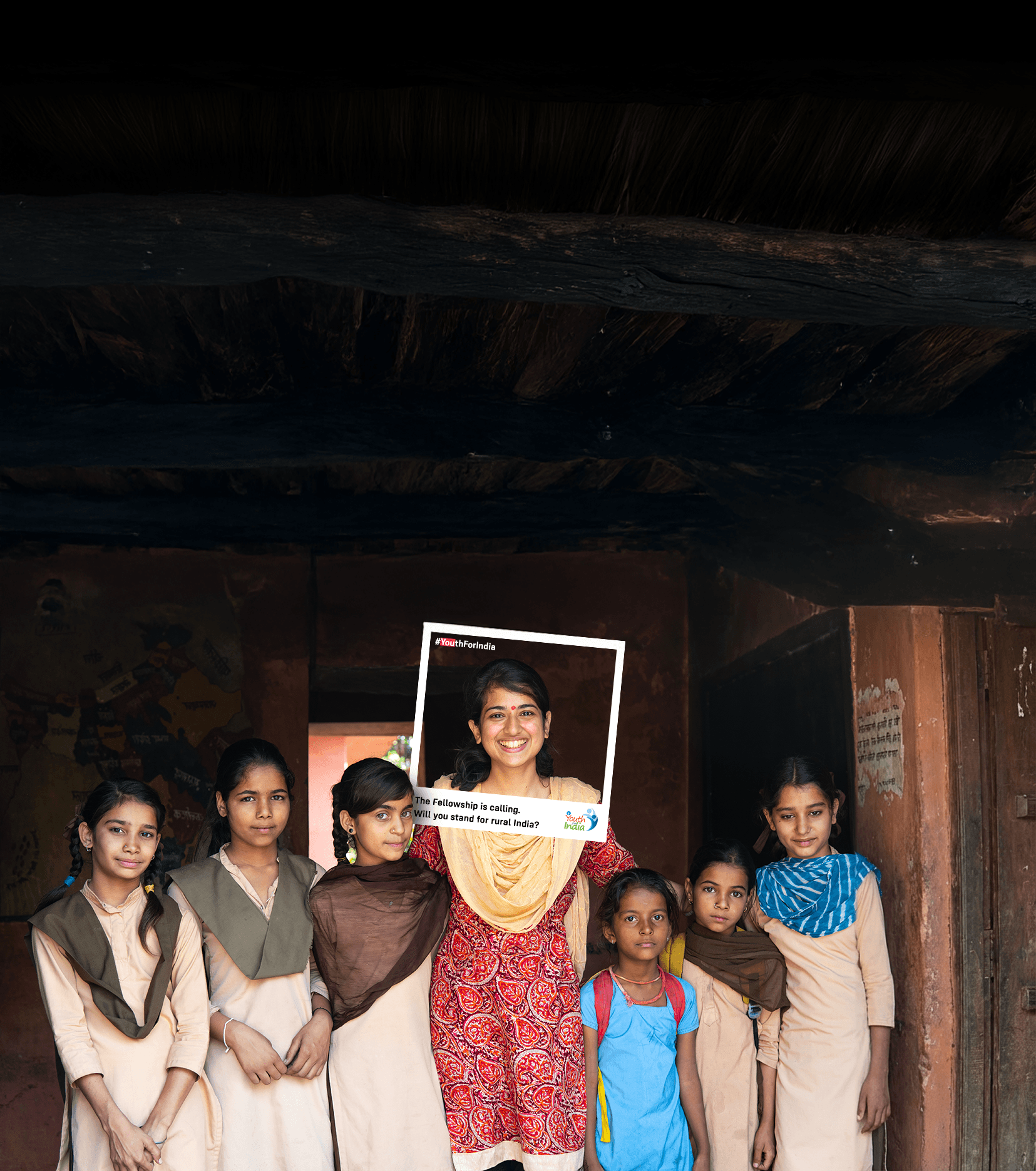
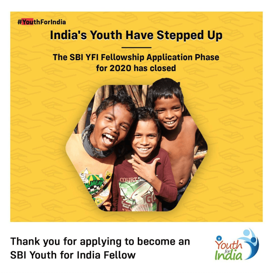
We introduced a polaroid-inspired visual language, to signal that these were moments from the field, captured earlier, with context and reflection.


The shift
Over time, we saw applicants arrive with better context and clearer intent. Conversations during interviews changed. The program started attracting people who were mentally prepared for the reality of rural India.
The biggest signal I felt was when people could recognise YFI content without seeing the logo.


What stayed with me
This project showed me how branding, content, UX, and performance don’t work in silos. When they align, they quietly improve outcomes.
If I were to revisit it today, I’d refine the icon system further, and try harder to get the YFI team to change their color palette, but I’m proud that the work has lasted this long, without needing constant reinvention.
Impact
Overview
Year
2017
Client
State Bank of India
Role
Creative Strategist
AGENCY
Altorise
Team
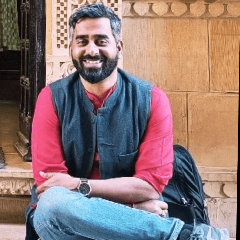
Praveen (Creative Director),
Sunny Joshi (Creative Strategist, Client Servicing)
Pavan Suthar (Design),
Uzma Begum (Motion),
Harsh Devani (Client Servicing),
Dhiren Shah (Tech & Web)